The most common neutrals used in home design are shades of white, beige, ivory, and cream. Gray is a surprising and elegant alternative choice that’s flexible and sensuous and never drab or mousy, despite its stereotype.
Most often, gray is a peaceful, easy color that makes a room feel serene, although it can be edgy and super modern when it’s used for elements like concrete flooring and countertops
Darker grays can be a focal point of your room.
Gray isn’t only a neutral; darker and more intense shades of gray can be a focal point of your color scheme rather than a background shade.
If you’d like to start small with a touch of gray, consider drapery, throw pillows, table and bed linens, lamps, artwork and wall paint.
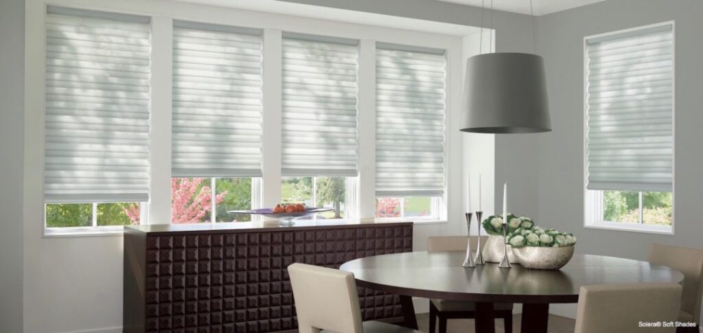
Larger design features include:
– Kitchen cabinets or counters
– Window coverings
– Rugs and carpeting
– Upholstered furniture
– Tile and stone
Gray pairs well with other colors.
Gray is seldom a pure mix of black and white. Its range includes cool and warm tones, because most shades of gray incorporate touches of blue, yellow, pink, green or other colors.
Gray plays well with other colors, because it allows them to grab all the notice. Perfect to pair with gray are: red, blue, white, pink, gold, black, brown and white.
Want to clear away the drab and mousy in your home decor? Plan on adding gray this year! For more ideas and help with your next design project, contact us here at Curtis Carpet Inc.